For the BATMAN YEAR 100 trade dressing, given that the tone of the story has more than a little bit of Orwell's 1984, I wanted to find something which felt like a logo you'd see on an old heavy metal album--like an Iron Maiden or Motorhead record cover from the '80s. Those album cover designs always lean toward upsetting, oppressive imagery (especially if the guys in the band aren't particularly good looking)-- crude symbols of militarism and decay, images of Kaiser's ridiculous, pointy-tip helmet, rows of yellowed skulls under frayed national flags, crumbling Egyptian pyramids, jagged mountain peaks under lightning-scarred skies, gleaming motorcycle chromes belching great bursts of red flames and smoke--etc. etc.
If these designs had a scent, they'd smell like brimstone and sulphur and gunpowder and rotting flesh. This stuff is like catnip to upset, oppressed adolescent boys.
Whoever it was designing those old albums seemed to agree, by commitee, conformity, laziness, or default, aside from apeing Frank Fratzetta, nothing works better typographically to convey a sense of overwhelming gloom than applying what used to be called "Blackletter", an historically significant and greatly misunderstood typeface:

Blackletter was the basis for the Year 100 logo primarily for its heavy metal associations, although there is also a nod toward the birth of modern offset printing in there as well. The other, more subtle reason-- the Yin reason-- is because I love early cinema, especially German silent film, and particularly Fritz Lang's Die Nibelungen, which is probably my favorite film. Blackletter is used extensively throughout the film.
I started with the basic, organizable shapes of the word BATMAN, trying to find an "in" into the letter arrangements as they might appear in different, possible geometric formations. Eventually I worked up an acceptable logo template. Next came a more finalized, hand-wrought version, which is how I prefer to create logos, by hand, but in this case we needed something re-formattable and slick. And slick means vectors.
Since I don't know if I trust my skills in Illustrator enough to create slick-looking vector-based graphics, I called in my sometimes design-collaborator RINZEN.
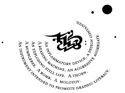
RINZEN, of course, got it, but wanted to add a touch of graphitti street art to the design. Although I have serious problems with what you might call graphitti typographic design aesthetics such as they are (basically, on the whole I find graphitti as a kind in-itself to be often clubbishly hermetic and deliberately illegible, two disasterous qualities when it comes to trying to convey any message other than confusion and ostracism), I have absolutely no problems with RINZEN's design aesthetics, typographically or otherwise. Here are two of the more recognizeable forms (we had others) which we submitted before we came upon the final, print-ready form:

...what we wound up with was basically a logo from a heavy metal album cover circa 1984.